
Mellissah Smith is a marketing expert, author, writer, public speaker and technology innovator. Having worked with more than 1000 companies across technology, medical services, professional services, manufacturing, logistics, finance and health industries, Mellissah has a well-established reputation as an experienced marketing professional with more than 30 years experience. As the founder and managing director of Marketing Eye, she has taken the company from startup to a multi-million dollar enterprise with offices in Australia and the US. She is the founder of AI software company, Robotic Marketer, which automates the development and management of marketing strategies. Mellissah is also the Editor in Chief of Marketing Eye Magazine, a quarterly magazine that cover marketing, entrepreneurship, travel, health and wellbeing. She is also the co-editor of Contact Centre Magazine, Minimalistic Magazine (building products and architectural design), and Human Magazine (wellness). #mellissahsmith #marketingeye #roboticmarketer
Leave a comment
Make sure you enter all the required information, indicated by an asterisk (*). HTML code is not allowed.
comments ( 7 )
Ariel
04 Jun 2014There is lots of valuable advice on your own site.
ReplyI'm planning on sending this article to my Facebook friends along ith sharing it on Flickr.
Thanks!
Bobby Boudrie
21 Nov 2013Hi my family member! I wish to say that this article is awesome, nice written and include approximately all significant infos. I
ReplyPure Max
05 Sep 2013This is the best website I own period seen suited for
Replydiscount green coffee beans.
Jessica
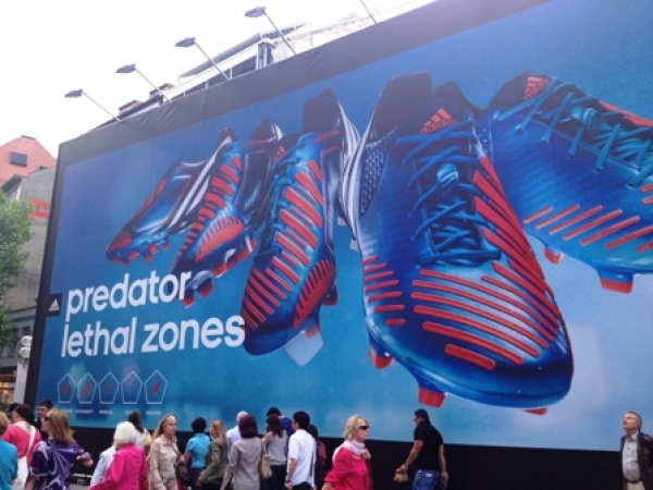
07 Jul 2012I think this ad is great! The simplicity of it, especially the background colour and the positioning and style of the text draws your attention to the product that is, in itself, a very graphically appealing and unique looking shoe. Ultimately this billboard is eye-catching because of the product, not the creative work, and whilst this is not always achievable for every brand, seems to have worked wonders for Adidas.
ReplyKathryn Wilson
05 Jun 2012I like this bilboard due to its simplicity aswell. The moto less is more can be very effective in advertising- especially on billboards when people are just walking by.
ReplyAnthony
04 Jun 2012At first I thought that ad was just some awesome graphic work, but then I found out the shoe actually looks like that, with the red marks on it and everything. I'd buy a pair but I am incredibly unsporty and they'd probably go unappreciated.
ReplySandra
01 Jun 2012I like this ad. The best ads are the ones that are simple and stand out.
Reply